圖解 Flexbox 進階屬性
06 Apr 2017flex-basis
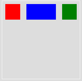
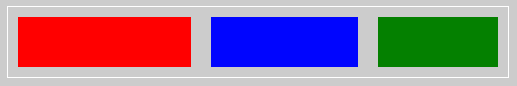
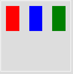
更改主軸 (main axis) 的預設屬性值,現在主軸是水平的,位於主軸上的屬性是 width。如下範例中,flex-basis 會將紅色、綠色方塊的寬度設為 50px,而藍色方塊的寬度設為 100px。
<div class="container">
  <div class="item red"></div>
  <div class="item blue"></div>
  <div class="item green"></div>
</div>
.container {
  display: flex;
}

.item {
  flex-basis: 50px;
  height: 50px;
  margin: 10px;

  &.red {
    background: red;
  }

  &.blue {
    background: blue;
    flex-basis: 100px;
  }

  &.green {
    background: green;
  }
}
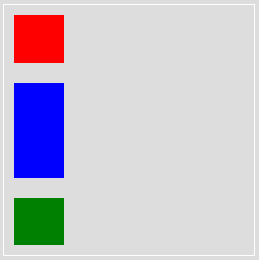
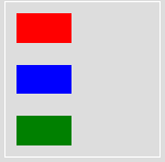
假設使用 flex-direction: column 讓主軸旋轉為直向,使方塊垂直排列呢?位於水平軸 (main axis) 上的屬性就是 height,會被更動到的屬性是方塊的高度。
.container {
  display: flex;
  flex-direction: column;
}

.item {
  flex-basis: 50px;
  width: 50px;
  margin: 10px;

  &.red {
    background: red;
  }

  &.blue {
    background: blue;
    flex-basis: 100px;
  }

  &.green {
    background: green;
  }
}
flex-grow
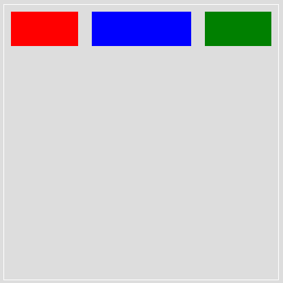
每個區塊 (這裡是指小方塊) 可在主軸上佔容器的多少部份,或說是如何分配剩餘空間,可參考-flex-grow 的計算方式。
例如:每個小方塊預設是佔 1 份,但是藍色小方塊可佔 2 份。
.container {
  display: flex;
}

.item {
  height: 50px;
  margin: 10px;
  flex-grow: 1;

  &.red {
    background: red;
  }

  &.blue {
    background: blue;
    flex-grow: 2;
  }

  &.green {
    background: green;
  }
}
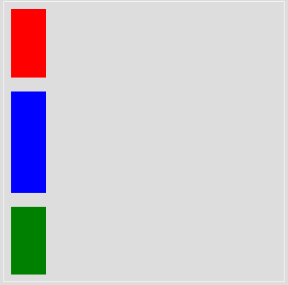
若更改主軸方向為直向,則會是這樣
.container {
  display: flex;
  flex-direction: column;
  height: 500px;
}

.item {
  width: 50px;
  margin: 10px;
  flex-grow: 1;

  &.red {
    background: red;
  }

  &.blue {
    background: blue;
    flex-grow: 2;
  }

  &.green {
    background: green;
  }
}
flex-shrink
與 flex-grow 相反,flex-grow 是膨脹,flex-shrink 是縮小,但說縮小也太籠統了, 應該是如何在空間不夠的狀態下,依比例縮小以適應有限空間?
如下圖,三個小方塊的寬度本來皆為 200px 且左右各有 10px 的 margin,因此總寬 200px * 3 + 10px * 2 * 3 = 660px 超過 container 的 500px,因此紅藍綠三小方塊依 flex-shrink 的設定,分別應縮小 1、2、3 倍。
- 超過的寬度為 660px - 500px = 160px
- 紅色小方塊的新的寬度為
200px - (1 / (1 + 2 + 3) * 160px)= 173.3px - 藍色小方塊的新的寬度為
200px - (2 / (1 + 2 + 3) * 160px)= 146.6px - 綠色小方塊的新的寬度為
200px - (3 / (1 + 2 + 3) * 160px)= 119px
注意,若比例是用小數點且總和小於 1,則又是另一個算法了。可參考-flex-shrink 的計算方式。
.container {
  display: flex;
  width: 500px;
}

.item {
  width: 200px;
  height: 50px;
  margin: 10px;

  &.red {
    background: red;
    flex-shrink: 1;
  }

  &.blue {
    background: blue;
    flex-shrink: 2;
  }

  &.green {
    background: green;
    flex-shrink: 3;
  }
}
flex-wrap
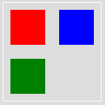
設定小方塊是要強制排成一列或依照容器的包圍而排成多列。
wrap
小方塊依照容器的大小分列排列,在這裡分為 2 列。
.container {
  display: flex;
  flex-wrap: wrap;
  border: 1px solid #fff;
  width: 140px;
  height: 140px;
}

.item {
  width: 50px;
  height: 50px;
  margin: 10px;

  &.red {
    background: red;
  }

  &.blue {
    background: blue;
  }

  &.green {
    background: green;
  }
}
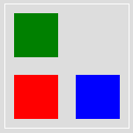
wrap-reverse
概念同 wrap,只是順序相反。
.container {
  display: flex;
  flex-wrap: wrap-reverse;
  border: 1px solid #fff;
  width: 140px;
  height: 140px;
}
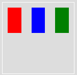
nowrap
小方塊排成一列不折行,可使用 flex-direction 調整主軸方向,即小方塊對齊的方向。
.container {
  display: flex;
  flex-wrap: nowrap;
  border: 1px solid #fff;
  width: 140px;
  height: 140px;
}
row
主軸為水平向。
.container {
  display: flex;
  flex-wrap: nowrap;
  border: 1px solid #fff;
  width: 140px;
  height: 140px;
  flex-direction: row;
}
column
主軸為垂直方向。
.container {
  display: flex;
  flex-wrap: nowrap;
  border: 1px solid #fff;
  width: 140px;
  height: 140px;
  flex-direction: column;
}
flex
以上 flex 屬性的綜合設定,意即:
flex: flex-grow flex-shrink flex-basis;
其中,預設值分別是 flex-grow: 0、flex-shrink: 1、flex-basis: auto。
因此 flex-shrink 的範例就可改寫為
.container {
  display: flex;
  width: 500px;
}

.item {
  height: 50px;
  margin: 10px;
  flex: 0 1 200px;

  &.red {
    background: red;
  }

  &.blue {
    background: blue;
    flex: 0 2 200px;
  }

  &.green {
    background: green;
    flex: 0 3 200px;
  }
}
相關閱讀-圖解 Flexbox 基本屬性
推薦閱讀 / 參考資料
- Even more about how Flexbox works — explained in big, colorful, animated gifs
- 56.图解 Flexbox 2 - 深入理解 · Issue #60 · ccforward/cc
- 在設定 flex-grow 和 flex-shrink 的時候,有時候會忘記設定 flex-basis 導致沒反應,可參考-flex-wrap not working
- 詳解 flex-grow 與 flex-shrink


