圖解 Flexbox 基本屬性
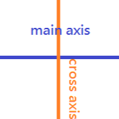
04 Apr 2017主軸和交叉軸
flexbox 基本上都是靠主軸 (main axis) 和交叉軸 (cross axis) 運作的。
display: flex
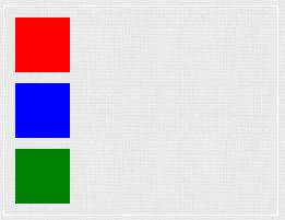
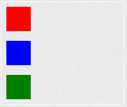
block element 的 display 值預設為 block,因此三個小方塊-紅、藍、綠皆呈現一直行排三列狀態。
<div class="container">
  <div class="item red"></div>
  <div class="item blue"></div>
  <div class="item green"></div>
</div>
.container {
  display: block;
}

.item {
  width: 50px;
  height: 50px;
  margin: 10px;

  &.red {
    background: red;
  }
  &.blue {
    background: blue;
  }
  &.green {
    background: green;
  }
}
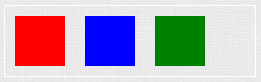
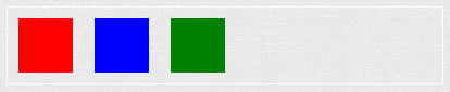
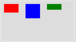
若將父元素 container 改為 display: flex,則會呈現一橫列狀態。
.container {
  display: flex;
}
flex-direction
設定主軸 (main axis) 的方向,可讓主軸旋轉。
row
主軸為橫向。
.container {
  display: flex;
  flex-direction: row;
}
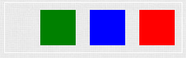
row-reverse
主軸為橫向,但反序排列。
.container {
  display: flex;
  flex-direction: row-reverse;
}
column
主軸為直向。
.container {
  display: flex;
  flex-direction: column;
}
column-reverse
主軸為直向,但反序排列。
.container {
  display: flex;
  flex-direction: column-reverse;
}
justify-content
主軸的對齊方式,共有 6 種選項
- flex-start
- flex-end
- center
- space-between
- space-around
- space-evenly
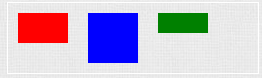
flex-start
靠左對齊。
.container {
  display: flex;
  justify-content: flex-start;
}
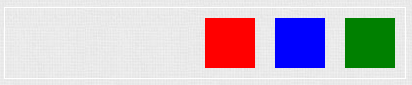
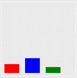
flex-end
靠右對齊。
.container {
  display: flex;
  justify-content: flex-end;
}
center
置中對齊。
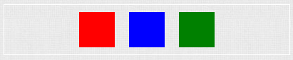
.container {
  display: flex;
  justify-content: center;
}
space-between
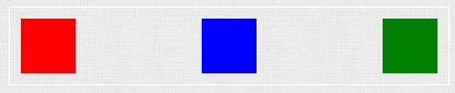
.container {
  display: flex;
  justify-content: space-between;
}
space-around
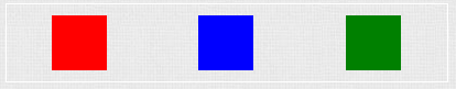
.container {
  display: flex;
  justify-content: space-around;
}
space-evenly
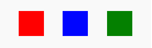
.container {
  display: flex;
  justify-content: space-evenly;
}
space-between vs space-around vs space-evenly
- space-between:每個小方塊擁有相同的間隔,但與父容器之間沒有間隔。這裡會有 10px 的空隙是因為我將每個方塊預設有 10px 的 margin 的緣故。
- space-around:每個小方塊之間與父容器有間隔,但小方塊與父容器之間的間隔是小方塊彼此間隔的一半。
- space-evenly:每個小方塊之間和與父容器之間擁有相同的間隔。
align-items
交叉軸 (cross axis) 的對齊方式,共有 5 種選項
- flex-start
- flex-end
- stretch
- baseline
- center
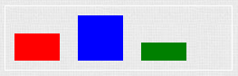
flex-start
若小方塊不等高,則會依容器的頂端對齊。
過去在沒有 flex 的世界裡,若希望小方塊向上對齊會使用 vertical-align: top。
.container {
  width: 250px;
  height: 140px;
}

.item {
  width: 50px;
  margin: 10px;
  display: inline-block;
  vertical-align: top;

  &.red {
    background: red;
    height: 30px;
  }

  &.blue {
    background: blue;
    height: 50px;
  }

  &.green {
    background: green;
    height: 20px;
  }
}
現在就可以改用 align-items: flex-start 了。
.container {
  display: flex;
  align-items: flex-start;
}

.item {
  width: 50px;
  margin: 10px;
}

.red {
  background: red;
  height: 30px;
}

.blue {
  background: blue;
  height: 50px;
}

.green {
  background: green;
  height: 20px;
}
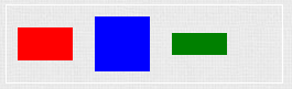
flex-end
若小方塊不等高,則會依容器底部對齊,類似過去使用的 vertical-align: bottom。
.container {
  display: flex;
  align-items: flex-end;
}

.item {
  width: 50px;
  margin: 10px;
}

.red {
  background: red;
  height: 30px;
}

.blue {
  background: blue;
  height: 50px;
}

.green {
  background: green;
  height: 20px;
}
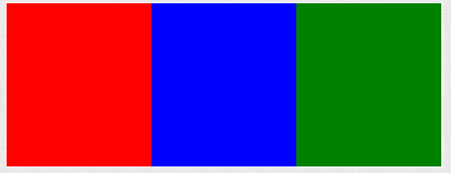
stretch
小方塊不設定寬、高、間距,充滿整個容器。
.container {
  display: flex;
  align-items: stretch;
}

.item {
  flex: 1;
}
baseline
若小方塊不等高,則會依容器的基準線對齊,類似過去使用的 vertical-align: baseline。
.container {
  display: flex;
  align-items: baseline;
}

.item {
  width: 50px;
  margin: 10px;
}

.red {
  background: red;
  height: 30px;
}

.blue {
  background: blue;
  height: 50px;
}

.green {
  background: green;
  height: 20px;
}
center
若小方塊不等高,則會依容器的中線對齊,類似過去使用的 vertical-align: middle。
.container {
  display: flex;
  align-items: center;
}

.item {
  width: 50px;
  margin: 10px;
}

.red {
  background: red;
  height: 30px;
}

.blue {
  background: blue;
  height: 50px;
}

.green {
  background: green;
  height: 20px;
}
備註:align-items IE 只支援 11 (含)以上。
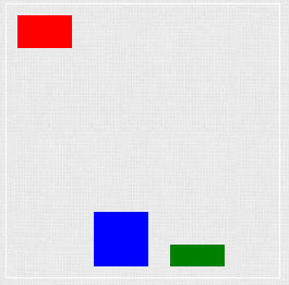
align-self
設定單一元素的對齊方式,會覆寫父層 align-items 的設定。
.container {
  display: flex;
  align-items: flex-end;
}

.item {
  width: 50px;
  margin: 10px;
}

.red {
  background: red;
  height: 30px;
  align-self: flex-start;
}

.blue {
  background: blue;
  height: 50px;
}

.green {
  background: green;
  height: 20px;
}
相關閱讀:圖解 Flexbox 進階屬性

